UX in Open Source Software
I like Open Source Software, or OSS for short. It's a great concept: People from all over the world come together to create something they would love to see, and share it with other people, so that they, too can enjoy and contribute to it. It's a noble cause and the fact that it's working so well for a lot of projects is super awesome and shows that people have the potential to doing good without being selfish.
I know there are a lot of issues with OSS. Especially licensing, or making money in general. Big corporations that rely on open source software to build their empire, while giving nothing (or very little) back. Often times they even bully open source maintainers into offering free support and SLAs, which in itself is a whole different story. Then there's the issue with forking, which in my opinion happens too often in general. Especially for smaller projects, this often means that there are seven different versions that all have their benefits and drawbacks. Five of them are already dead. Instead, focussing on one release would probably have been the better option.
But compromise is hard. And I think that's part of the issue I'm trying to raise today. Let me preface this by stating that I am by no means an UX expert. I'm just some guy talking about some things he noticed when using OSS.
The First Impression
How can you tell whether a project is open source? Well, for one thing the website probably looks something like this:
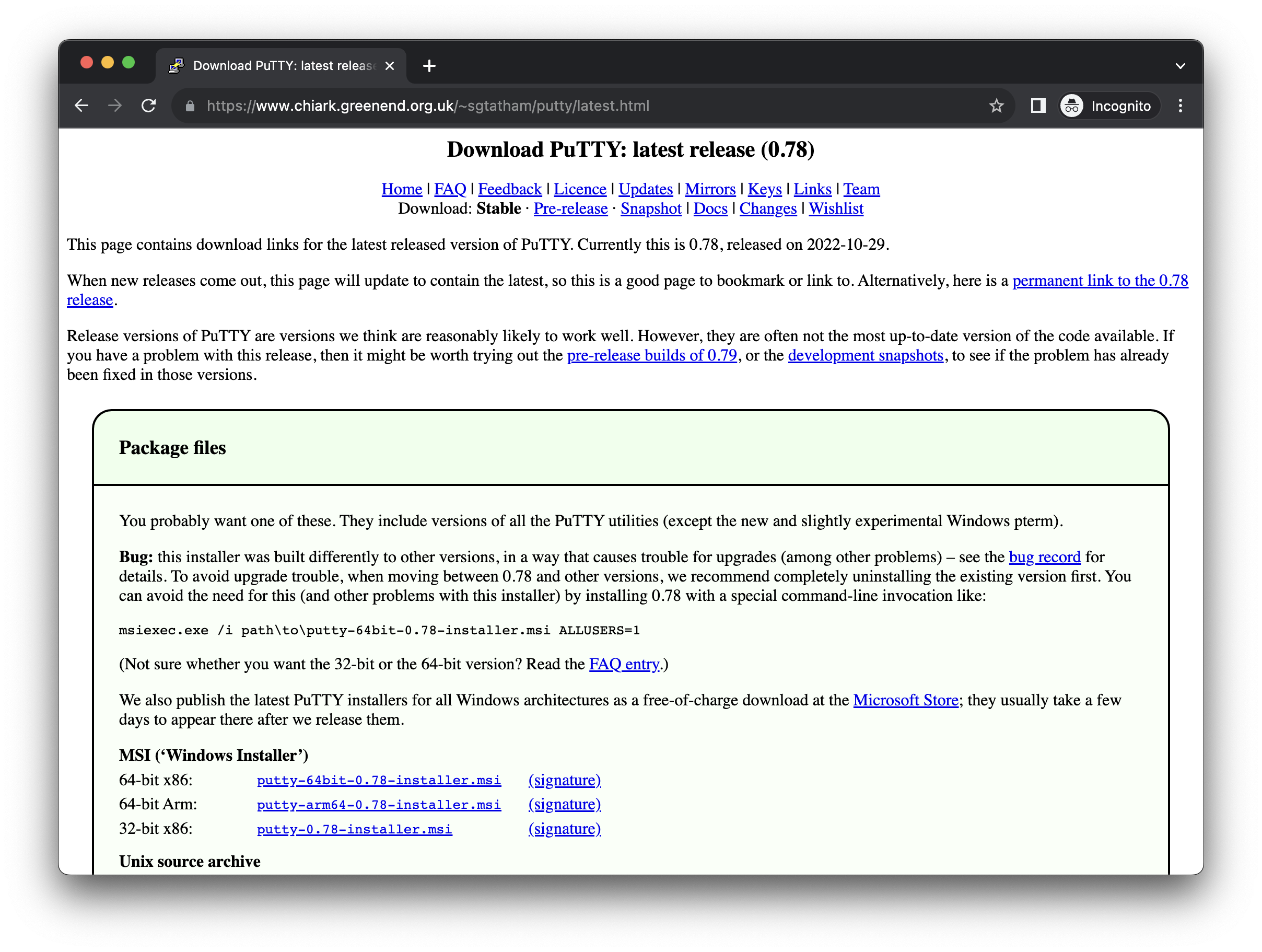
Okay, to be fair, this has gotten better in the last couple of years. But often times it still lacks one of the most important things a page like this needs: A simple, straight-forward download button.
Open source software often times prides itself with the ability to run on Linux (Arch, Debian, Red Hat, x86, arm), BSD (freeBSD, macOS (PowerPC, Intel, arm and universal), openBSD), Windows (98, XP, 7, 10, 11, 64 bit, 32 bit, 16 bit and 8 bit, available as exe and msi), OS/2 and z/OS. Of course, a build is readily available for each of these platforms and can be found on GitHub under the Releases section right after some nightly, beta and RC builds. It's super easy! Just pick the OS and architecture you are on, select the version you would like to run (version 3 is in development, version 2 is available but doesn't yet support all the features, version 1 is legacy but recommended if your last name ends in "y"), download the binary - or better, include the repository in your package manager, or build the sources yourself if you prefer to enable some build flags, and you're good to go! Easy peasy!
I hope you get where I'm going with this. The average user don't care. The average user don't even know! "I have a computer. It's a black one. I think it's Windows or something. How many bits? 32 or 64? I think I have 16 GB of memory." And that's not because they're stupid, that's just because they don't (need to) care. Same way I don't know what my shampoo is made of. It doesn't matter. Why is there not just one big download button that downloads the software for my currently running OS?
I am writing this article because I just downloaded and installed the "ungoogled-chromium" project to try as my new default browser! And yeah, the project doesn't even have a homepage from what I can tell, and installing is as complicated as you can imagine. It's hard to see the issue when having on the "Nerd-goggles", but let's do a little role-playing, okay?
Role-playing Time!
Assume you are an average Internet enjoyer sitting in front of their Windows PC. You're tired of Microsoft Edge, so you want to try something new: The "Ungoogled Chromium" has been recommended by your tech-savy friend. So it must be cool, right?
You type in "ungoogled chromium" in Bing and the first page you see is this GitHub project. What do you do?
First of all, you are confused by what's going on. What are all these files? You just want to download the software! - Let's assume that somehow you manage to scroll down and see that there's information on the project there (and believe me, that is already a huge assumption. Normal people just do not get GitHub. It's super confusing, and I've seen quite many people struggle with it already).
So you scroll down, and you see a "Downloads" link in the content overview - and sure enough, you get to the "Downloads" section. More text, though. Ah, well, let's read.
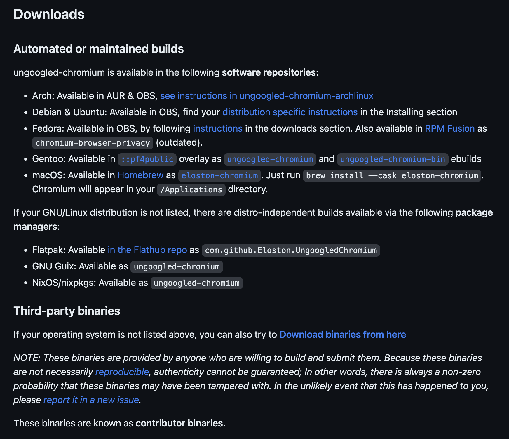
You know some words in that list! You know Ubuntu is an operating system you don't have, just like macOS. So you assume there must be something for Windows. But there isn't. Confused, you read on: "If your operating system is not listed above, you can also try to Download binaries from here"
Okay. You have no idea what a "binary" is, but let's head over to that page...
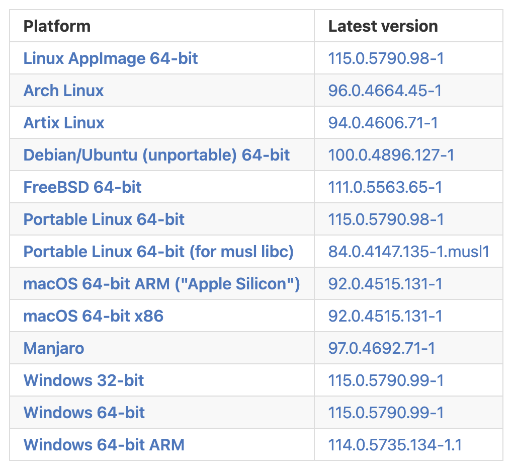
Uhm... Okay, Windows. There it is! But what version do you have? Windows 11. That's not listed there, though. Okay, well, let's pick the first Windows one in the list. Would make sense that the recommended version is the first one, right? So you click on "Windows 32-bit":
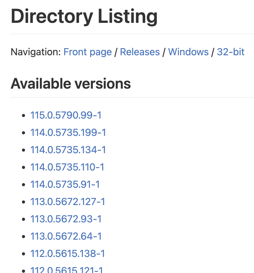
Oh for goodness sake! Just give me a download! Okay, let's click the first one. Surely that will start a download, right?

Good lord! Again, two choices! And what's with all these weird numbers? At this point, you're probably frustrated and already decided to keep using Edge ;) But hey, at least this time you will actually get a download. It's the 32 bit version (which by the way suddenly is called x86, so much for consistency), but hey... who needs to address more than 2 GB of RAM in a browser anyways, right?
Onboarding
Let's assume the user somehow managed to download, install and run the software. Many open source tools have some kind of idea of onboarding. And that's great! Often times it's some window or dialog that pops up the first time a user opens the application.
The only problem is: People don't read. They really, really don't. Seriously. No. They just do not read. Especially if it's a popup. Popups get confirmed right away no matter what they say. Sure, this is on the user, but that's the way it is. And yes, I, too am guilty of this. Often times have I spent a significant amount of time trying to figure things out instead of reading the documentation for a few minutes. Sure, there are exceptions. Often times I do read (or at least skim) the documentation, just to find that it's either horribly outdated or just poorly written and assumes that the reader is familiar with the application already. Why would I read the documentation then?
But I understand. Writing documentation is a tedious task, and keeping it up to date is even more tedious. And you're not even getting paid, so you'd rather spend time implementing new features or fixing bugs. I absolutely understand. But in my opinion, documentation isn't even the biggest issue (as long as you're not offering support via Discord) in most cases. Often times there is enough searchable information out there that can be found in forums, GitHub issues or on Reddit (notice how Discord is not part of this list, and therefore part of the problem) so that issues can be resolved by the user if they just find the right page.
The bigger problem is...
Sensible Defaults
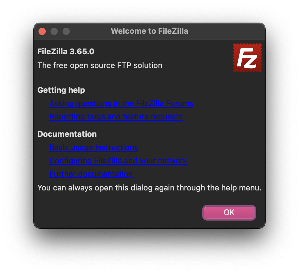
So, the user managed to download, install and open the open source application. They clicked away the onboarding dialog, as they do, and now they have the application open and want to start!
Let's get back to the reason I started writing this article: My download of Ungoogled Chromium. Unfortunately I can't show you the onboarding page I got, because I closed it already (at least I read it, because otherwise it would have been a painful experience - more on that in a bit), and I don't know how to open it. Funnily enough, I tried opening the help page (Menu > Help), which greets you with this beautiful page:
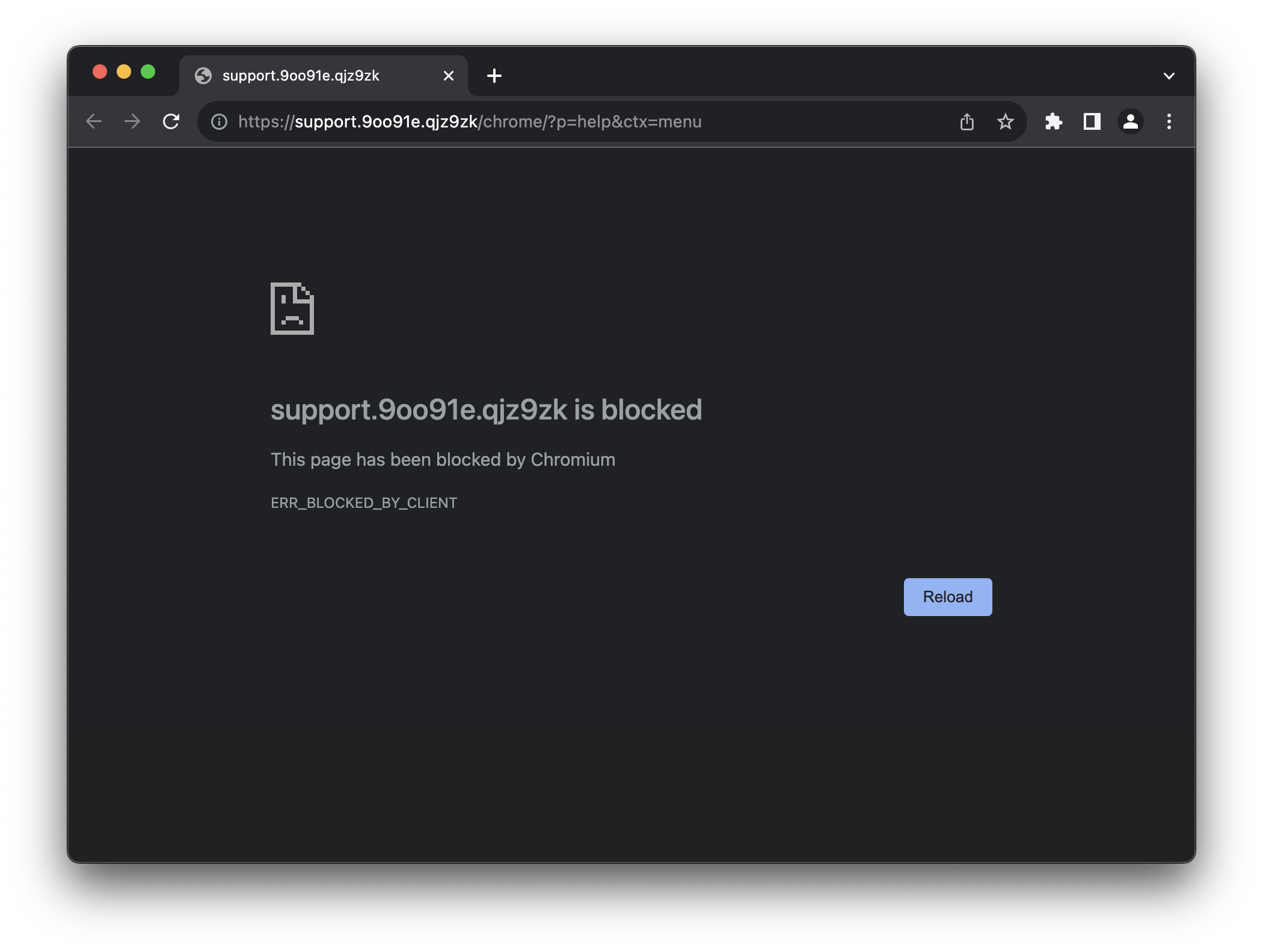
Cool. Moving on! What's the first thing you do when using a web browser? For me, it's searching for someting. I personally first set up my password manager extension, so that's what I did: I opened a new tab and typed in "bitwarden", as this is the name of my password manager. I expect, since this is the ungoogled version, to get a search result from DuckDuckGo or Startpage or whatever. Let's see what happens!
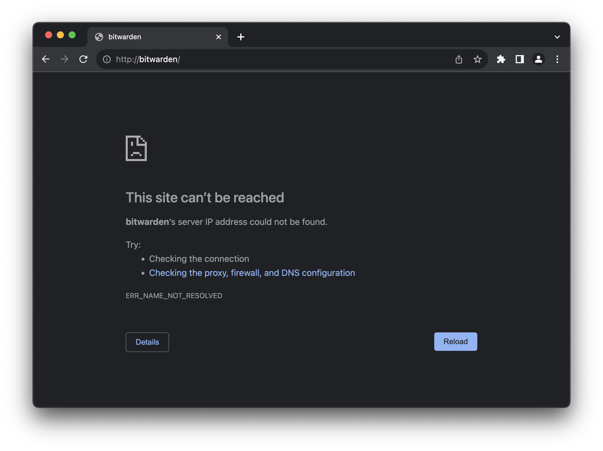
You have to be kidding me. Turns out, degoogling means to just rip out everything Google and replace it with nothing, literally. The default search engine is literally "no search". At this point, every last average user closes the browser and never opens it again. Sure, I get that it's not the main focus of the project. After all, degoogling is a niche use case that (sadly) only nerds attempt to do, and I'm certainly not trying to shit on the project in any way. It's merely a symbol for what I experience quite often in open source software: It is designed for software developers that are fine with turning a thousand knobs, levers and config parameters to get their software to behave the way they want it to.
This is how this project works, too. Setting up a new search engine needs to be done manually by going to the settings of the browser. Then, when trying to install extensions from the Google Web Store, you also need to first enable some config flag and install an extension that talks to the Web Store, in order to properly use it. It's all outlined in the welcome section after onboarding, but like I said: Nobody reads it, and in my opinion it makes no sense to have to jump through hoops just to enable something that everyone will do eventually. Everyone needs some search engine, so why not set some search engine as a default? Everyone needs some extensions, so why not set it up so that they can be installed without having to configure three things? No harm done if you're not using it, right?
Oh, and of course, by default third-party cookies will be blocked, and all cookies will be cleared when you close the browser. While this may sound like a sensible default, it really isn't. What good does clearing cookies when closing the browser do? Nothing. It's just annoying. If you care about not being tracked, install an extension (lol) like uBlock Origin, which of course isn't pre-installed. The use of third-party cookies is debatable, and I understand why this is a default here, but the reality is that this will break the login of a lot of websites without the user understanding why. One could argue that this is a trade-off when using a browser focused on privacy, but then again, this is just a degoogled version without any ad blocker or other privacy enhancing features pre-installed.
Other Examples
I feel bad for picking on Ungoogled Chromium all the time in this article. Again, I don't mean to critisize their work. They do this for free, are kind enough to make it publicly available, and everyone can improve on it if they feel like it. They just happen to be the example I was confronted with most recently, but they are by no means the first or worst.
Let's take kbin as another example. kbin is a decentralized Reddit-alternative built on the same ActivityPub protocol that is used by the Fediverse (Mastodon is probably something you have already heard of). It is also compatible with the bigger Reddit-alternative that also uses ActivityPub, Lemmy, which I found to be very open-sourcy when it comes to UI/UX. So I wanted give kbin a try instead.
The idea is you create an account on some instance (for example kbin.social), and then you follow/subscribe to communities. kbin calls these "Magazines", Reddit calls them "Subreddits", but it's the same concept. For example, a community for "technology". The nice thing about Lemmy/kbin is that these communities don't necessarily have to be from the same instance (kbin.social in my case), but that's besides the point. After you have subscribed to a few communities that interest you, you get posts that are sent to these communities delivered to your home feed. So, you can search for topics that interest you, and then you get content for these topics. A bit like RSS, but, you know, with an added community aspect.
Sounds pretty simple. I sign up, subscribe to a few communities that interest me, and then I hit the "kbin" logo on the top menu to get to the home page and - I suddenly have posts in my feed that belogn to communities that I didn't subscribe to. Is it broken?
Nope. Just another bloody default that makes no sense whatsoever.
Query: Where do you have to click to see your home timeline? You know, the one where all the posts of these magazines that you just subscribed to appear.
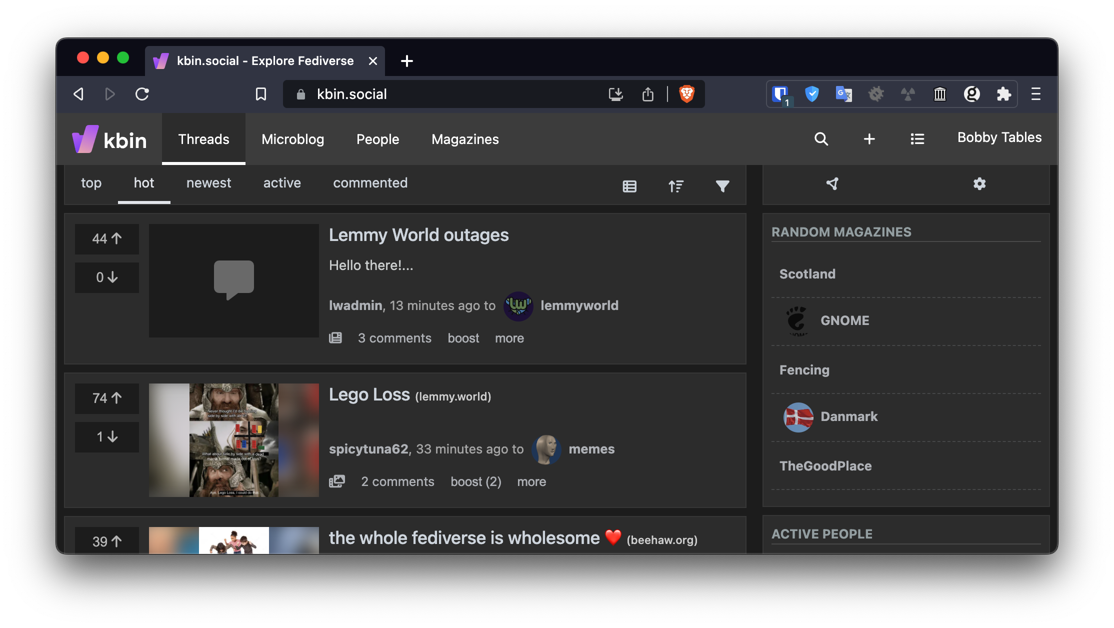
"Threads" seems to be the homepage, and this lists all new posts. So that's not it. Maybe "Magazines"? After all, that's what the communities are called on kbin. - Nope. That's just a list of all magazines on this instance.
I'll give you a hint. It's that little drop-down menu that appears on the top right next to your username:
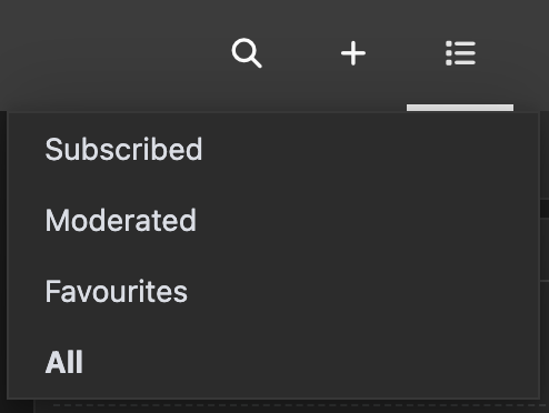
Yeah. You have to click on "Subscribed" to see a list of the magazines that you actually care about. Oh, and of course this can be configured. In your "Settings" under "Appearance", you can set your "Homepage" to "Subscribed" instead of the default "All".
So, to recap: kbin is a social media platform whose whole purpose is to find magazines that you would like to subscribe to, and to then show you posts of said magazines. And the default is that it shows you just all the posts. So, if you want for your subscribe action to actually have any effect whatsoever, you need to either navigate to a sub-menu or change a setting. I'm sorry, but who thought this would be a good idea?!
Concluding
All right, so what's my point?
Primarily, I just wanted to vent. It pains me to see so many great open source tools that have the potential to have a real impact on society fail because of some silly little defaults or onboarding issues that could be prevented by just taking off the nerd-goggles and thinking from the point of an average user. Yes, many quality of life features mean extra development work, but in many cases all these features are already there - they're just hidden away in convoluted settings pages, command line parameters or build flags. And every time someone recommends changing the defaults, a huge discussion emerges that ultimately results in nothing changing at all.
I used to build my own Android custom firmware back in the day. Now I use an iPhone precisely because I don't have the option to configure everything just the way I want it, but because it mostly is already configured that way by default. Yes, there are some things I wish I could change, but it beats the hell out of having to play around with the settings for three hours every time I get a new phone, app or update.
I used to use Linux on the deskop. It was pretty neat, once I spent weeks setting up my perfect i3 window manager config, and another few days getting wifi, sound and my graphics card to work. Unfortunately, I no longer have the time and energy to do that, so I now use macOS, because the important things just work and have sensible defaults so I can do my job.
I wish the same could be said about open source alternatives. But in most cases, this just isn't the way it is. I guess we need more UX people in open source.